Migration Label Redesign
package design | production
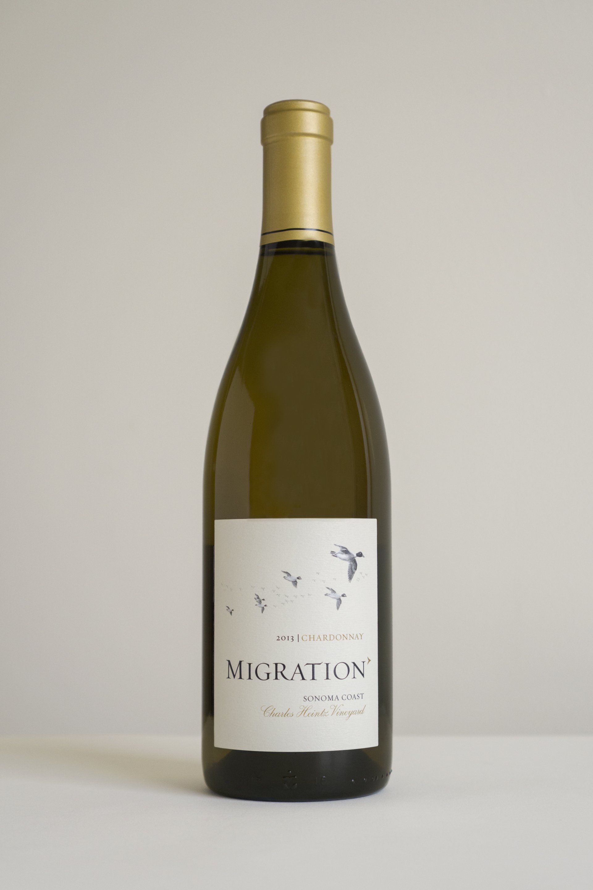
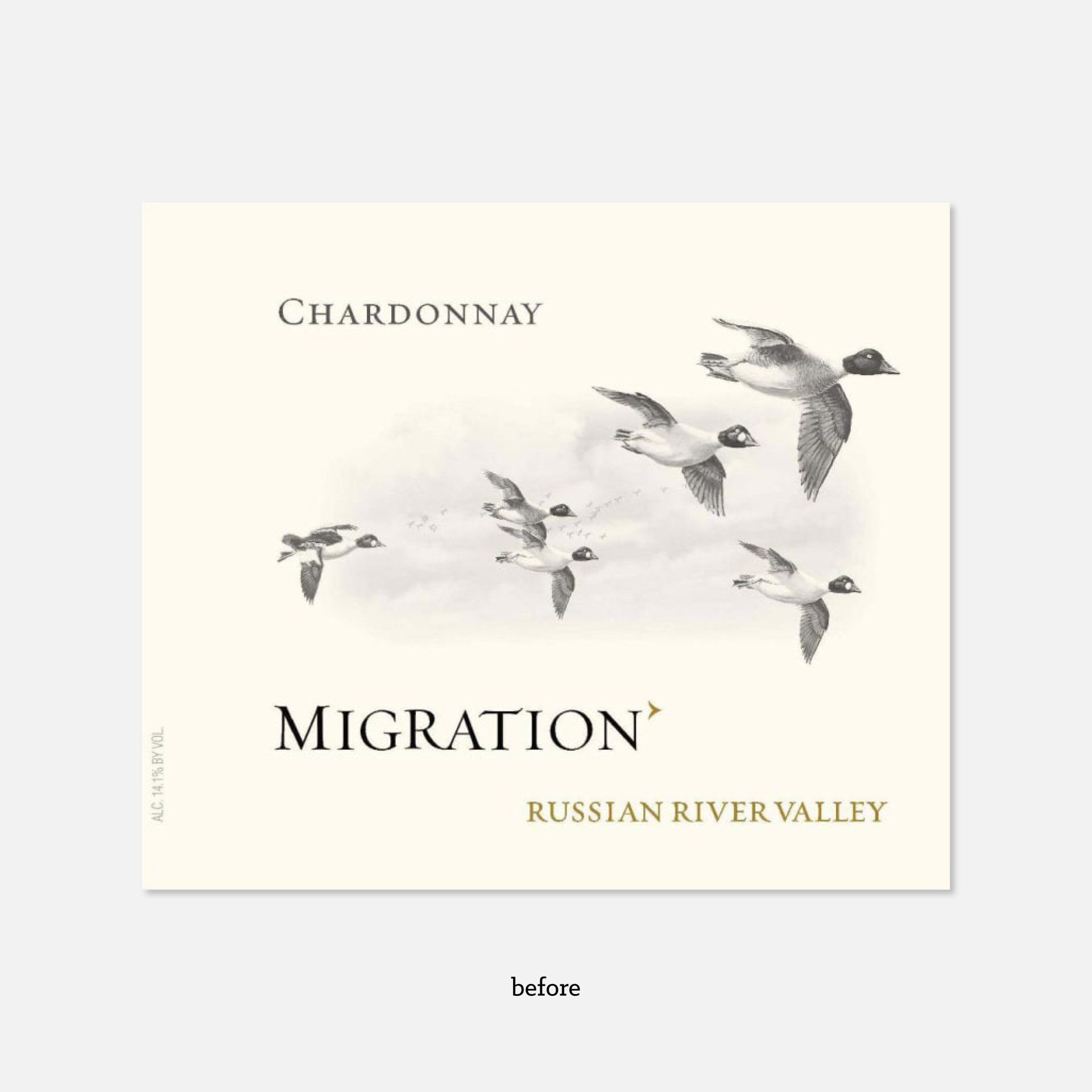
Duckhorn Wine Company might just be, dare I say, the king of Napa Valley. This parent company was one of the first 40 wineries to occupy this iconic wine region and remains a top player in premium winemaking to this day. The marketing team at Duckhorn Wine Company wanted to freshen-up the labels of one of their most valued wines, Migration. It was important that with this refresh, Migration still felt recognizable and maintain it’s original sophistication.
I, along with the Art Directors at Gravity Creative, felt that in order to achieve a fresher and more modern look we we’re going to have to pinpoint the right updates at a precise and subtle level. And that’s exactly what we did.
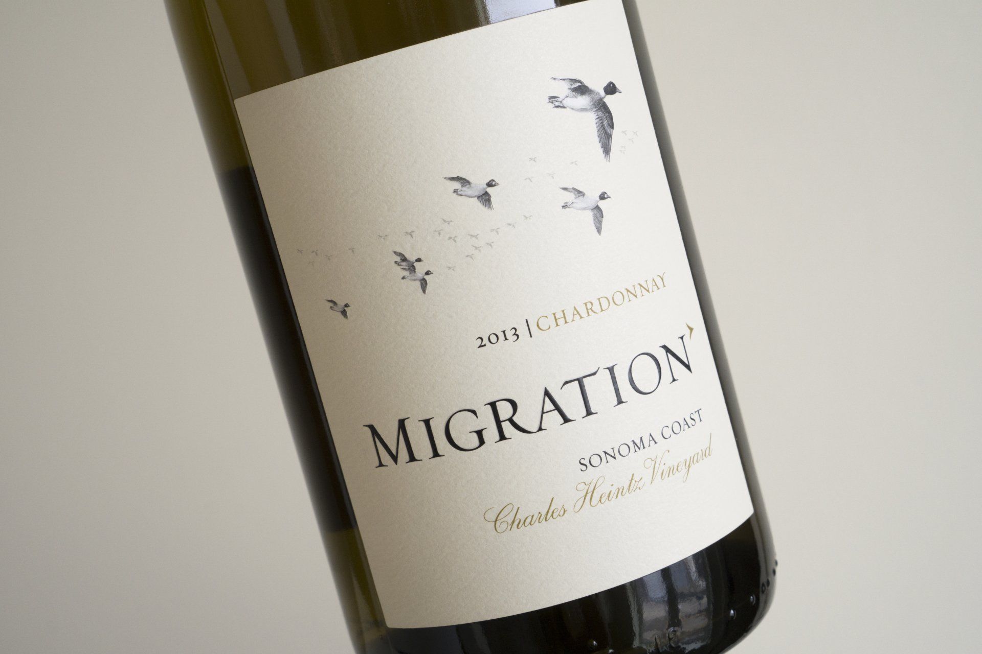
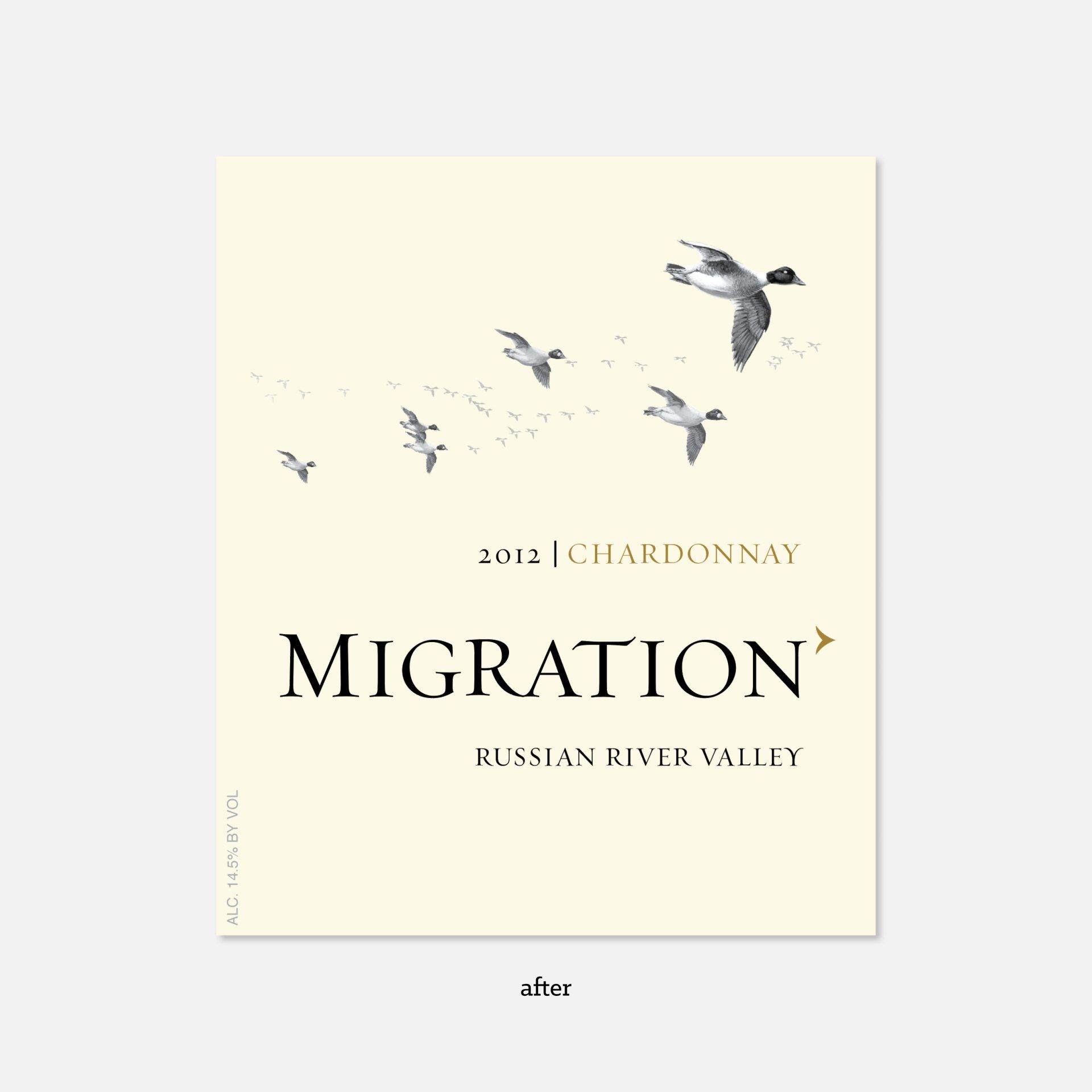
My solution: right-aligning the logo, varietal, and appellation and cleaning-up and repositioning the duck formation. These subtle changes are enough to to make the label feel more buttoned-up without leaving Migration lovers searching high and low at their markets for their beloved wine.
My solution: right-aligning the logo, varietal, and appellation and cleaning-up and repositioning the duck formation. These subtle changes are enough to to make the label feel more buttoned-up without leaving Migration lovers searching high and low at their markets for their beloved wine.