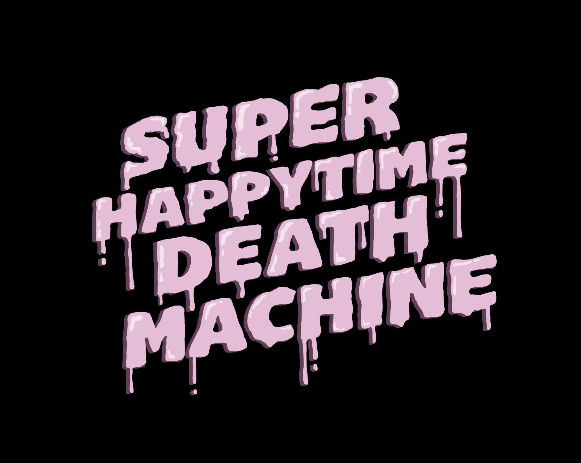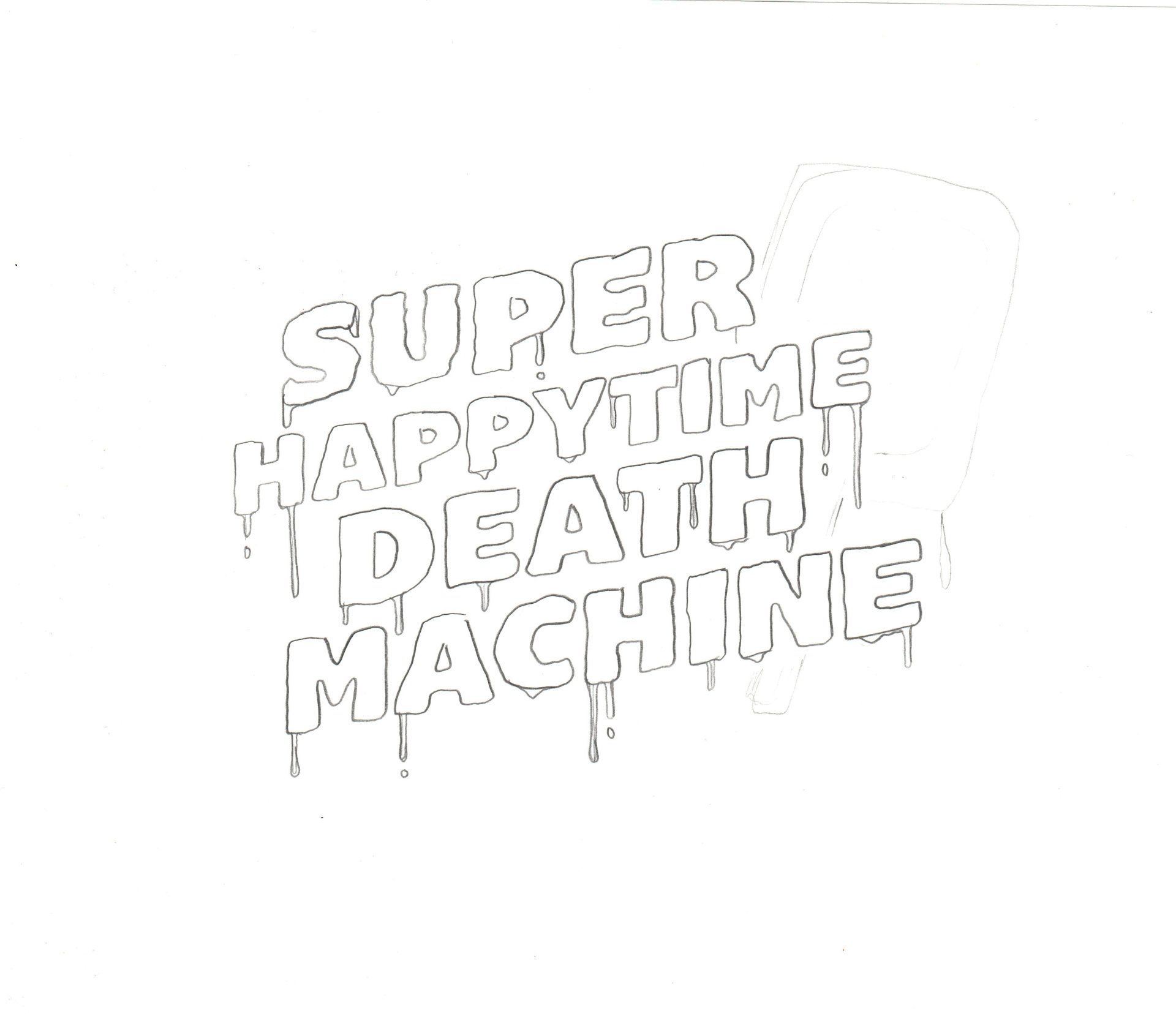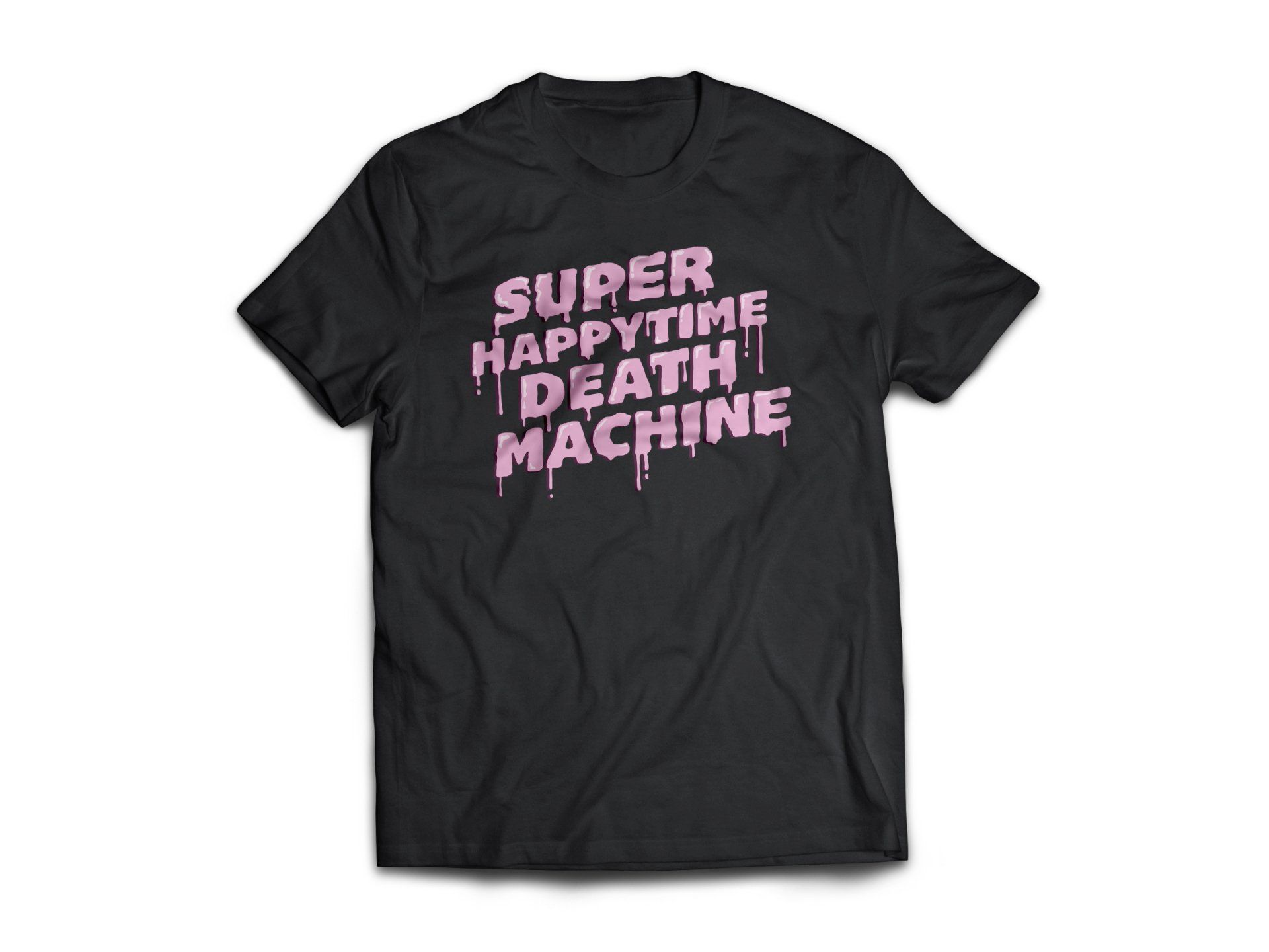
Super Happytime Death Machine
lettering | snowboard graphics
Don’t be fooled by this local snowboard start-up’s flood of baby pink and melty ice cream motif. These boards have some serious edge that absolutely rip! The juxtaposition of a brand embracing a delicate pink in an industry mostly dominated by dark, masculine graphics instantly piqued my interest. I was tasked with creating a typographic lockup that embodies this cartoon-like style while maintaining just the right amount of edge – Think strawberry ice cream cone with a chip on it’s shoulder.